A while ago Buck Wilson, the designer in a small team of Portland-bound guys, contacted me about icon design for Here, File File!, an iPhone app that lets you connect back to your Mac from anywhere and read, view, and stream your files. As opposed to the popular Dropbox and iDisk apps, it allows full access to all the files on your Mac, instead of just a few hand-picked ones.

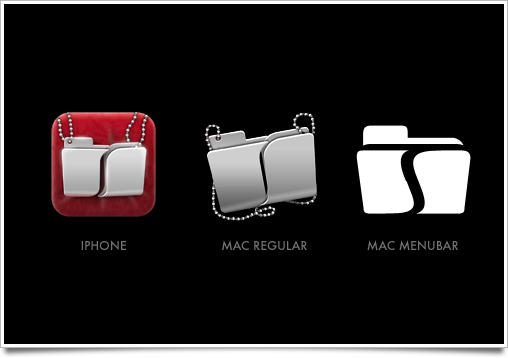
I happily started working for them to make a kick-ass icon. There was an additional challenge as multiple icons were required: a Mac icon, a menubar icon, and an iPhone icon, which required a metaphorical connection between all of them. Buck mentioned they had an idea for using a doghouse for the Mac app and a dog with files on the iPhone, but I recommended against using animal motifs. Not only do we have the classic divide between ‘dog people’ and ‘cat people’ to worry about; animal motifs are just not very suitable in iPhone icons.
And thus the conceptual phase began, which we kicked off with a bunch of sketches of various possible designs and metaphors that could work in the menubar, on an OS X disk image and on the iPhone. I wanted to focus primarily on the iPhone icon design, though, as this was the selling point of the application in the App Store.

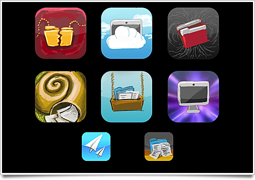
Some of the concepts for the iPhone icon.
In the end, we settled for the companion necklace metaphor. Some of the other concepts were nice, but didn’t communicate the application purpose as nicely or had so much branding value. Now the challenge was to extend the concept and develop it further so it could be expressed in a consistent way in all three usage scenarios.
The iPhone icon was mocked up with actual shape layers, and sent to Buck for review. Buck loved it, so I proceeded to iteratively develop it into the final icon.
![]()
Above is the full iconparison™ of the first mockup to the last proposed final version. It went through quite a few revisions until we arrived at the final version, with all its nice details that are invisible in the revision history image. The little silver beads on the necklace, for instance, reflect the pillow and pendants accordingly depending on their position in the icon. They were all hand-drawn in Photoshop, though I occasionally did a quick 3D render to check if it was all ‘right’.

I completed the menubar and Mac icon, just in time for the release of the app. Buck did a kick-ass job on the website, using some parts from the iPhone icon’s PSD to make an awesome consistent branded look.
Here File File is available from the App Store, and while biased, I recommend getting it. It’s one of those things that can save your ass when you’re out and forgot a file.