Interarchy is a Mac app that’s almost as old as I am: it was first created in 1993 as one of the first FTP clients for the Mac, and in 2007 it was sold to its current owner and long-time developer of Interarchy, Matthew Drayton of Nolobe. Matthew contacted me with a request for new icons for the big upcoming version 10. This was no small release, so it had to be worth it.
![]()
Like several other FTP clients, Interarchy has always been known and discerned by its icon. By now, it’s a powerful brand. Matthew also expressed his desire to maintain the filing cabinet metaphor in the application icon, and I agreed. Changing the icon now would mean neglecting its long history and evolution.
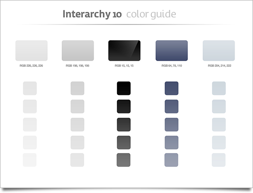
While I am not a huge fan of outspoken themes in icons for an application, the stylistic direction Matthew envisioned of aluminium / silver, black, and perhaps subtle desaturated colors summoned beautiful visions of icons in my head. I think this could be a great theme: not too outspoken like icons that are bright blue and black, but a subtle kind of consistency that gives the icons an extra quality when used together.

It’s also the set of colors and materials we consider typical of Apple’s latest generation of hardware. This makes the icons appear very modern and advanced, very much in line with what we wanted to represent with the Interarchy icons. Interarchy is a powerful and feature-rich application, and making the icons beautiful, but also appealing to the target user base is a great bonus.
I won’t bore you too much with the process of all the icons, but some of the concepts of the application icon are interesting to see. I did mockups of a thin-edge ‘full black’ cabinet and a pure aluminium one. And how about a cabinet resembling a Mac Pro?
![]()
In the end we settled with the current, beautiful yet unassuming icon for the application, and with a few revisions and emails back and forth we arrived at an equally satisfying set of supporting icons for the application itself. Matthew was awesome to work with, and we were both very happy with how the icons turned out. You can see the full set a bit larger on the Nolobe Blog here.
![]()
By the way, Nolobe (makers of Interarchy) are having an awesome Fire Sale right now, which is worth checking out.